Thursday 27 November 2014

Research: Graphic File Format

https://www.youtube.com/watch?v=17oZ0pg1xLA.

In this YouTube video, the presenter discuss the different image formats, Including JPEG, Gif, TIFF, PNG, EPS.


This is a screen shot taken from the website BBC/Bitesize. It explains how image formats like JPEG are created with pixels that create a higher resolution. The more pixels the higher resolution, hence; 360p, 480p, 720p, 1080p.


JPEG - A file which compress image files. JPEG stands for "Joint Photographic Experts Group".

PNG - (Portable Network Graphics) This file format that compress image sizes. This format is usually found while using Photoshop.

TIFF - (Tag File Image Format) This file format is used for carrying raster graphic images, between different programs, this format is commonly used for scanning.

BMP - A format which is used to save raster graphics files.


GIF - (Graphics Interchange Format) A file format which supports both animated and static images.

- This is an example of a GIF image, this image supports the animation format, hence the moving images.


Thursday 13 November 2014

Evaluation

                                                             Evaluation

In my creative media course I have been working on my graphic sector. This evaluation will describe and explain the all the steps during this unit.  Including the codes and conventions, fonts, media texts, poster and Blu-Ray sleeve.

1: Skills Acquisition:
During our graphics unit, I have learned to use media industry programs such as Adobe CS6 Photoshop and Adobe illustrator. I have learned several skill and techniques that are used in the media industry.
I have created a self portrait on photoshop http://jimfletch.blogspot.co.uk/2014/10/adobe-illstratior.html. From creating this self portrait on adobe illustrator, I have learned about used post-photography to manipulate an a real image, to create the perfect model and also gained knowledge about raster and vector graphics. .http://jimfletch.blogspot.co.uk/2014/09/skin-smoothing-on-photoshop.html  This link is my film poster. I also designed a film poster into photoshop based on my own ideas. My poster was a crime drama film similar to 'The Godfather', From this task I learnt about how to use photoshop to create posted similar to posters made in the film industry. http://jimfletch.blogspot.co.uk/2014/10/poster-evaluation.html. This is a link to my poster evaluation, in the evaluation I explain the steps I went through to create my poster and describe any mistakes I made and improvements I should make to make the poster more realistic. During the making of my poster, I have learnt basic skills of photography. I have also experienced the green screen technology that is used within this industry and has help me to create more professional and efficient imagery.


- These are images that were taken during the photography stage of my poster design.  We used a white screen for the background, so we could change it in photoshop. I also used a prop gun for my poster, so that the audience has a clearer indication of the films theme.


2: Research and Ideas stage:
After studying the codes and conventions, we starting looking towards the format and the genre of my final product this included discovering and explaining the fonts which are used on film posters, and creating my ideas for my poster.  This link is my poster illustration of myself which I created on Adobe Illustrator, in this blog I discuss how I created the self portrait and the mistakes and improvements I have made on the original project. http://jimfletch.blogspot.co.uk/2014/10/poster-illstrations.html. I also wrote a proposal idea for my film poster.http://jimfletch.blogspot.co.uk/2014/09/proposal-for-poster.html. To create my Blu-Ray sleeve, I research real Blu-Ray cases and sleeves online to discover the size of a Blu-Ray case, the imagery which is presented and the stimulatory and differences they have to each other design. I further evaluate this subject on this page http://jimfletch.blogspot.co.uk/2014/10/dvd-and-blu-ray-sleeves.html
3: Design Stage:
The next step of this task was to sketch out my ideas, I had created a coloured sketch for my poster. Which I further explain in this blog http://jimfletch.blogspot.co.uk/2014/10/poster-illstrations.html. Which shows the sketches I had made for my poster. I sketch my designs by hand and scanned the pages and uploaded them onto photoshop.

4: Evaluation Of Final Designs:
After I had finished the final product, my next task was to create the final poster on photoshop, I have made a blog which goes into depth of the making of my final poster design http://jimfletch.blogspot.co.uk/2014/10/poster-evaluation.html.  When I completed my poster evaluation , I created a blu-ray sleeve from the poster I previously created. I used photoshop to design my Blu-Ray sleeve. I further evaluate it on this task on this blog post http://jimfletch.blogspot.co.uk/2014/11/blu-ray-sleeve-evaluation.html.


Thursday 6 November 2014

Blu-Ray Sleeve Evaluation

For my creative media graphics sector, I was given the task to create a DVD or Blu-ray sleeve, using our posters as the front cover. I took several stages to achieve this task. Which I will describe and explain in this evaluation.

Final Product:


Step 1:


For the first step of this task, I screened shot an image of a blu-ray case and cropped the image so I only had the top of the case. I then opened this file into photoshop. I open this in the first layer of photoshop because the image did not need as manipulated as the other images were. 

Step 2:


Now I had Photoshop opened up, I created a new layer and placed in my film poster. Then I removed the blurb, name tags and production logo. I did this because on DVD's and Blu Ray sleeves the credits and found on the back cover and the actors names are commonly found on the back sleeve as well, this maybe because the audience for this home media product is easier to sell to an audience than the cinema tickets for the film, because chances are they have already seen the film or heard about through word of mouth and advertisements. And the film decreases in value after multiple viewings, where as in the cinema, they would pay more because they are not just paying for a film, but a social event.

Step 3:
The third step of this task was to create a spine for my Blu-ray sleeve.  I research the measurements online, and then applied them into Photoshop.

I found a image of a blank Blu-Ray sleeve online, I made a screenshot of the top and the bottom of the spine.  I then added the images into a new layer, which was on top of the background layer.

I added a new layer which I added the Blu-Ray logo, which I located at the top of the spine, which the logo is usually found on real Blu-Ray sleeves.

After adding the Blu-Ray logo I added a new layer, and inserted an image of CGI (Computer generated imagery) smoke. The smoke was used to give a mysterious theme, which would represent the films Crime/Drama genre. Similar smoke effects are found on other gangster film such as 'The Godfather'

Then I added the BBFC 18 certificate onto the next layer. I used the magic wand tool to remove the original white background from the image and opened it into a new layer above the previous images on the spine file.                                                                    

After placing the BBFC certificate my next task was to add a production logo, for this I chose the warner brothers logo. I downloaded the image off Google and opened the file into Photoshop. I then used the magic wand tool to edit out the background and moved the edited image into the layer with the rest of my Blu-Ray spine.


The third task in this activity was to create the back cover of the Blu-ray sleeves. I have used the same measurements fro my front cover which I researched on this website http://www.cd-info.com/packaging/blu-ray-cases/

The first task was to add the top and bottom layers of packaging, for this activity I have taken a screenshot online and have reopened the file into Photoshop.


Tuesday 21 October 2014

DVD and Blu-Ray Sleeves

 This is a DVD sleeve for the film "The Silence Of The Lambs".  The sleeve features the front cover, side cover, and back cover. The front of the DVD features the original film poster, which includes the production logo, which is MGM. The stars (Anthony Hopkins and Jodie Foster) and the age rating. the side cover includes the title and a spine insert image. The spine also includes the DVD logo, which is the format that the disc plays on. The rating is also shown on the spine cover. However this is an Australian copy of the film so it does not feature the BBFC (British Board Film Classification) logo because it is sold outside of the UK.

Similarities and Differences

This is a Blu-Ray slip cover for the film "Dawn Of The Planet Of The Apes".  The slip cover is designed to protect the DVD or Blu-Ray from external damage. Eg: someone steps on it,  or the case becomes dirty or stained. This slip cover includes a reimangened poster for the Blu-Ray.

Theatrical poster (Left)

The original poster includes less imagery, this is because it wants to entice the audience, but not give too much of the story away. The release date is displayed to inform the audience. The theatrical poster is usually a harder cell that the home media cover because the studio needs to make a profit at the box office, where as the Blu-Ray wound't need to because the majority of the audience have already seen the film.
------------------------------------------------------------------------
The 5 Ps Of Marketing:

Product -Product is different to a film poster, it's a physical product instead of an event.
Price - Because a DVD or a Blu-Ray is a physical product which a consumer can watch multiple times the marketers can sell the product at a higher retail price.
Place - DVD/ Blu-Ray's are usually sold in supermarkets, record stores (such as HMV), and Online shopping websites like Amazon or Play.com.
People - Dvd's/Blu-ray's will appeal to people to have previously seen the film, so advertisers would pay newspapers and magazines to advertise the release date and price of their product. This product maybe advertised in speclist magazine catering to the film's genre.
Promotion - Actors will sometimes appear on a television talk show such as Jonathan Ross or Graham Norton to advertise the production, although this is most commonly used just before the film is released in cinemas. 

---------------------------------------------------------------
Audiences

The primary audience of the DVD/Blu-Ray are the previous viewers of the films theatrical release. An advertiser would need to remind their audience about their home media release date, so they can sell the product to them at full retail price.


Friday 17 October 2014

Poster Evaluation

For my creative media graphics sector I created a teaser poster of a film I have created. The software used to create this was adobe Photoshop. I used several steps to create this poster.  
My first step was to find an image of the internet, I did this by using Google search. The second step was to create a landscape format on Photoshop. I did this my making the width coordinates wider. After opening Photoshop I downloaded an image of a black background of the internet and opened it into the background layer of Photoshop.  I then opened up a new layer over the background where I placed the smoke effect. I used the smoke because it makes the title stand out more and it also fits with the  "Crime/Gangster" film genre, the smoke in this posts gives the audience a feeling of mystery and gives the audience a interpretation of the perils that the characters may face. Next I created a new layer and added the gun, I used this object for my teaser poster, because it clearly represents the crime genre. Now all my imagery was in place, I inserted the text into the poster. For the films title I used the text tool and choose the font 'corlone' which I downloaded of www.DaFont.com, I used this font because it is frequently used in the crime drama gerne, and gives the interpretation of a Italian background.  I then added the poster blurb which I downloaded of 'cloud drive' and open into Photoshop, after editing the text with the text tool, I moved the text into layer of the poster. The poster blurb is used on to credit the work of the people in the key job roles of this film. Poster blurbs are also commonly found at the bottom of the film's poster. An image of a object that is related to a theme, such as the gun on this poster is called iconography in the media industry.

Mistakes/improvements:

After completing the design of this poster, I can recognise the mistakes I have made in comparison too real teaser posters. One of the mistakes I made was using the scale tool to minimise my text, this makes the text seem squashed. I think the gun on my poster needs to fade in more with the smoke background, in comparison to a real poster it feels out of place.
----------------------------------------------------------------------------------------------------------------------


The next task in my graphics sector was to design a theatrical poster for my film. In this evaluation I will discuss the steps made into creating my film poster.

My first step was to take photographs. For editorial reasons I used a white screen. This was because I could change the background with the colour range tool. I then opened the photographs into Photoshop.

Once I opened the photographs into Photoshop, I unlocked the background layer and used the colour range tool to edit the out the background in the photographs.

The next task was to create the background, which I downloaded off Google images and opened it up into Photoshop and placed the image into the background layer and places the edited photographs in the layers above.

Now the background was in place, the next step was to fit the characters into the poster. I did this by using the scale tool. The characters poses are inspired by the poster for the film "GoodFellas" which I have analysed for my poster analysis.
http://jimfletch.blogspot.co.uk/2014/10/poster-analyise.html

I then created shadows around the characters, this was inspired by the posters for "The Godfather" and "Goodfellas". For this task I used the paintbrush tool, and coloured around the characters face and body, like the poster for "The Godfather" I used the shadows to suggest that the characters are mysterious.

My next step was too add the smoke effect, to achieve this I used the screen shot I used for my teaser poster. I opened the image in Photoshop and used the magic wand tool to edit the black background out. I then moved the image into a new layer above the previous images used on the poster.

After inserting most of the imagery into my poster, I then moved on to editing text into my poster. For the title and name tags on this poster, I used the text tool and used the Corleone font because it fits with my posters crime/drama theme, this font is also inspired by "The Godfather" poster. After editing the text, I used the scale tool to edit the size of the text. The name tags above the actors on my poster was inspired by the "Goodfellas" poster.

For the credits used on my poster, I downloaded the image of cloud drive and uploaded it into Photoshop. I then edited the text with the text tool and added my name and the name of the actors into the poster blurb. I then moved the text onto my poster layer. and sized the text with the scale tool.

After editing the text I used the warner brothers logo which I downloaded of Google images. I then opened the image into Photoshop and used the magic wand tool to edit out the background. Then I moved the logo in a new layer above the previous images onto Photoshop. I used the scale tool to edit the size of the image.

The final task was to upload the BBFC 18 certifiacte onto Photoshop, which I made a screen shot earlier for my poster proposal. I then opened the screenshot onto Photoshop and used the magic wand tool to edit out the background. And then moved the image onto a new layer on Photoshop.

Mistakes/Improvements

When I used the paintbrush tool to create a shadow effect, I used it in the background layer, this made it difficult to edit or remove the effect without disturbing other images. To avoid this next time I will need to open a new layer when using the paintbrush tool. And also I will need to create new layers for each individual edits I make with the paintbrush tool.

Tuesday 7 October 2014

Poster Illustrations/Ideas

This is my drawn idea for my film poster. The genre of my film poster will be Crime/Drama. The layout of this poster is a portrait design. The front of the poster has the protagonist while the background includes the antagonists. The poster was drawn by hand, scanned and then uploaded to blogger.

The charractors in my poster all wear suits and ties to represent that they are 'in the business'. The idea for this inspired by the poster for the film 'Good Fellas'.


Font:

This is the font type I will be using for my poster. The font is called 'Corleone'. (Named after the mafia family in 'The Godfather). I downloaded this font off www.Dafont.com The font is also seen in the Goodfellas poster. The text is commonly used in the crime genre, because it represents a mix of italian and american culture which is how gangster are commonly portrayed in these type of films.


Images:

This is an image of a hand gun which I will photoshop into my poster. I downloaded this image offhttp://hdwallpapersfactory.com/wallpaper/guns_weapons_handguns_1911_handgun_pistolets_pistols_desktop_2836x1977_hd-wallpaper-231190.jpg


Monday 6 October 2014

Creating portrait in Adobe Illustrator

For the latest unit in my BTEC media course, I was given the task to create a portrait of myself using the vector graphics on Adobe illustrator. This task was to help understand the software and the difference between Vector graphics and Raster graphics. Images which are made of multiple pixels are named raster graphics. Vector graphics are made of patterned mathematical equations. While most Adobe softwares can handle Raster and Vector Graphics, it is more reliable if a user were to use Vector graphics on Illustrator because it is a primary function on that software. Raster Graphic are more convent to use in Photoshop because of the large size that a high definition file needs.


In this blog I will discuss and explain the steps taken to create my self portrait onto Adobe Illustrator.

Step 1: The first step was to take a picture of myself using Apple's photo booth program. I saved the image I had taken and opened it onto Adobe Photoshop.

Step 2: The second step was to use the transparent tool and change the transparency up so the photograph of myself fades in, allowing me to have a clear view when I draw and paint over the photograph of myself.

Step 3: I then used the pen tool to select the outline of my face, to do this I dragged the mouse around my face in the photogragh.

Step 4: The forth step of this task was to use the 'Eyedropper tool' which is used to sample the colour of my complextion, this was to make my cartoon self more familer to the skin tone in the photograph.

Step 5: The next thing I did was to fill the area of my pen tool with the couler I had selected with the eyedrop tool.

Step 6: The next step was to draw the other features (eyes, nose, lips and hair) of my face with the pen toll and colour them in.

 Step 7: The final step was to draw my clothes using the pen tool and colour them in using the customised colour tool.

Thursday 2 October 2014

Poster Analyise


For my BTEC level 3 media graphics unit I was given a task to analyse several different film and/or television posters. In this blog I will discuss what each poster represents and what is the posters target audience. I shall also explain why I have chosen these posters and how they will share simulates to my own work.


Boardwalk Empire
This is a wide poster for the HBO period crime drama Boardwalk Empire.  The is covered by the programme's main characters, appearing on the boardwalk, which is used as the shows primary location. The poster has a verity of colour, for instance the charractors on the left side are shown in the light, meanwhile the cast on the right are in the darkness, this could suggest a sepration of good and evil, or this could suggest that the characters behind are predators hunting the prey in front of them; this meaning that life on the boardwalk is so dangerous that it's primal. All the persons shown on the cover are looking in different directions, giving us a brief idea of their motives and intentions. For example, the man on the front is suggested to be the main character, he is shown with his fists clenched and has his partner wrapped around his arm, this shows that the character is protective of whatever he owns, his partner, his money, even his clothes, as they are shown to be immaculate and well presented. The young man behind them stares towards the right side of the poster, which is in the eye line of the middle aged man that walk beside him. The young man appears to be reaching for a weapon, attempting to protect the couple in front from the man walking towards them. Meanwhile in the far right corner we see three men standing in a semi-circle. They appear to be discussing something about the character who is walking in front of them, One of these three man seems to be hiding a gun, perhaps to sell or to use against the man they appear to be after. In the background we see lights that advertise the entertainment on the boardwalk, we see high brow nightlife such as ' The Supperclub' and low brow acts such as 'The Human Cannonball' this show the contrast on life on the boardwalk and can also represent the social standing of the characters present, and is also used as a reference to 1920's America. The title is decorated with the light bulbs that represent the nightlife of the boardwalk, this could suggest that the boardwalk is a fugazi, trying to hide it's true colours just like the programs characters. Because Boardwalk Empire is a television show and not a film the information regarding it's release is more specific, people do not only need the premier date, but also the time and channel, which are both presented on this poster. The target audience for this poster would be adults because of it's dark use of colours and theme, I also think this would attract a young adult audience (15-19) because of the glitz and glamor of it's historical settings.

The Godfather
This is a portrait poster for the 1972 film 'The Godfather'. This film is regarded by critics and audiences alike, as one of the greatest modern cinema has to offer. From the naked eye the outline and design for this poster looks very simple and basic, however the themes and emotions portrayed on the poster alone are complex, which reflex the film perfectly.
The colours used in the poster are dull, and have a rustic feel to them, as if they were referencing classic early 1900's cinema. The contrast between light and dark around the character shown could suggest that he is a good and honest man who is surrounded by evil and horror, or it can also tell the audience that this man is a leader because the spotlight is always on him. If one was to look in more detail, we could see that most of his features are silhouetted by the darkness, half of his face is in the darkness, suggesting he is either a liar, traitor or corrupt (two-faced). The man's eyes are also blacked out, indicating that he is a mysterious person who has concealed himself from others, which evokes the phase 'The more you see, the less there is". This individual clearly has a history and a unconventional lifestyle, and as the audience we are there to observe that. The title of the film is painted in a light bronze colour, implying wealth. Above we see a logo which displays a hand holding a handing which is used to control strings. This insinuates the idea that 'The Godfather' is a puppeteer; pulling on all the stings, controlling peoples movements and decisions to benefit himself. The tag line presented at the bottom of the poster reads, "I'm gonna make him an offer he can't refuse." Not only is this line a statement used in popular culture, but is also a line that tells us a great deal about the character is a few words, It confirms he is fierce, mighty and deceptive.
I think this poster would attract a mature adult audience (30+) because it's more subtle and dense than most film advertisements.
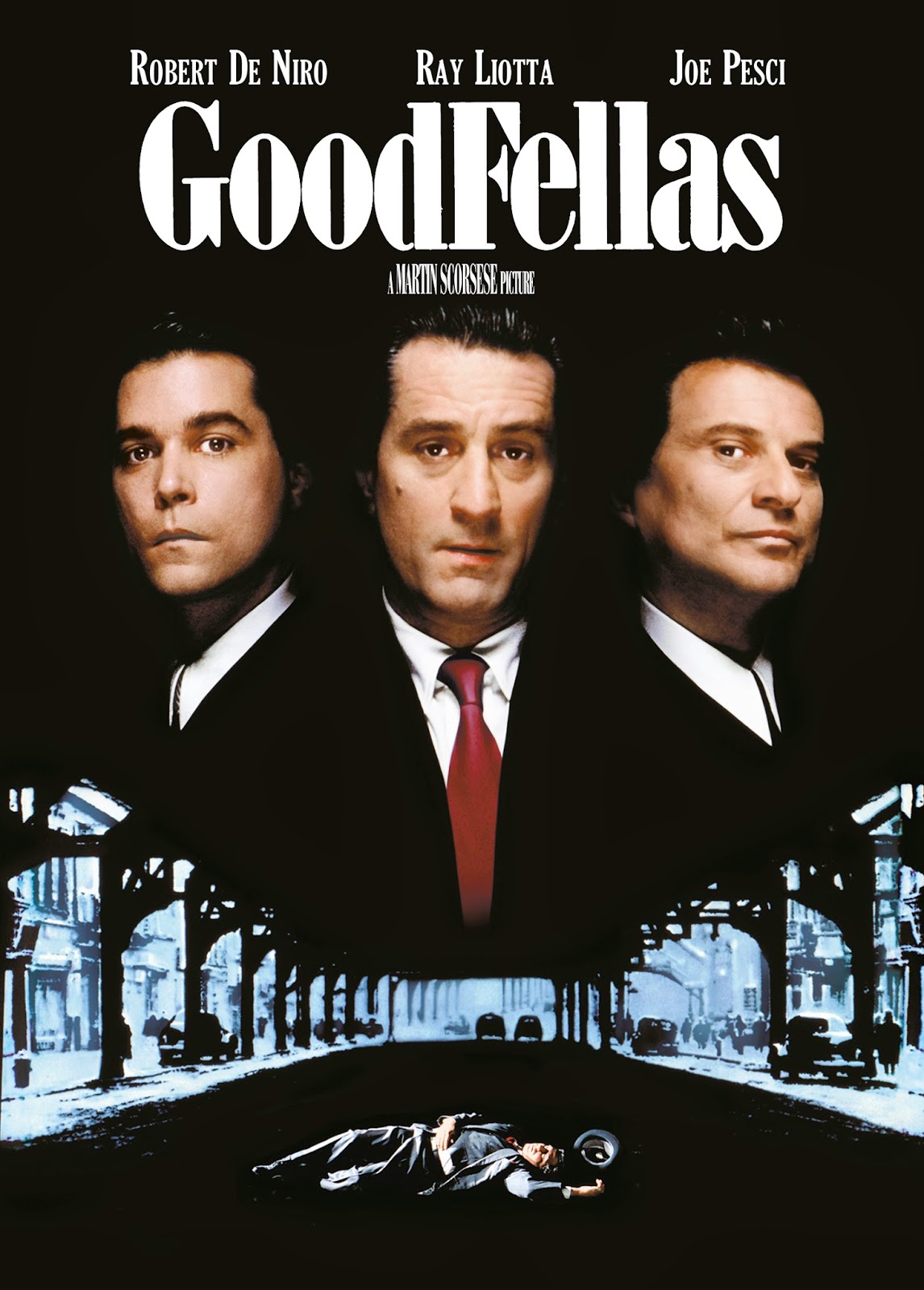
GoodFellas 
This is a portrait poster of the 1990 film 'GoodFellas'. The majority of the posters background is pitch black with only a V-shaped faded blue shadow, which shows up a street underneath a freeway. This could imply that the urban streets are a 'dark' and dangerous place to be. Appearing from the darkness we see three men who seem to be looking towards the audience., in a confrontational manor. Each actor is stood in the same place as there billing above them. Even though Robert De Niro is not the main character of the film, he is marketed heavily because of his fame which was peeking during the period 'GoodFellas' was released, this makes Robert De Niro the unique selling point. On the lower half of the poster we see a man lying dead in the road, we can see that he is wearing smart attire, this is clearly indicating that this film is part of the gangster genre and the harsh use of the violence throughout the film.
The films target audience for this poster will be aged from 16-50, and a largely male crowd, I believe this because of the violence portrayed in the poster. The films main unique selling points are the director, Martian Scorsese who is well recognised in the film industry and is known for his previous gangster films such as 'Mean Streets'.  Robert De Niro and Joe Pesci are also well known in this genre.

Taxi Driver 

This is a portrait poster for the 1976 film 'Taxi Driver'. The poster of this film has the effect of an caves illustration. The effect of this creates a parallel world in that the protagonist is suck in trying to escape into a purer world. Behind the man we see a taxi cab, I believe that the taxi resembles loneliness in this poster, The character feels need to stand in close proximity to the taxi, this could suggest that the taxi offers comfort and sanctuary to the protagonist. Another form of loneliness shown in the poster is shown by the empty streets and the darkness that surrounds the main character.
The unique selling point of this poster is Robert DeNiro. He is billed above the title, this is to grab the audiences attention, before they know anything about the film. The target audience for this film poster would be aged between 18-45, I think the aged look of the poster would put off a younger audience, however the references to film noir would attract people who are into classic cinema.


In conclusion, all of these posters are within the crime/drama genre which my poster will also fall into. These posters also attract an adult audience, which is the same audience that I want to attract with my poster.

Wednesday 1 October 2014

Different Genre Fonts


This font represents the Sci-Fi genre.  This font is well know for appearing in the Sci-fi/horror ‘Alien’ franchise. This font has a cold feel to it, which could represent death. The letting has a modern appeal that gives the audience an idea of the future.  The shapes in the lettering looks like reptile eyes which give the viewer a brief insight into the unknown creature/alien.
This font represents the action genre. The font is bold and is spelled in capitals to give a load shouting effect.  The type of action shown in this font has a military background, this could represent war, which suggests why the ‘action’ takes places.  This type of font is shown in the ‘Expendables’ franchise.

This font is used to represent the horror genre. Although this font is no longer widely used in mainstream media, it is know for it’s historical use. The font was first seen in the ‘Penny Dreadful’ pulp fiction; which was first published in the mid 1800’s. This font was also commonly used in the 1950-1980 ‘B-movie’ horrors. The font itself looks liquidised, with fingerprints spotted across the letters.  As if someone was bleeding against glass.

Tuesday 30 September 2014

Proposal For Poster

James Fletcher                      30/09/14

Proposal for Creative Media Production Project:
For my creative media production project I will be creating a film poster for a crime/drama film. 

Format and Medium: My project will be a print movie poster, The main poster will be in a portrait format, while my teaser poster will be in a landscape format, it is important that my poster is in a portrait format because it will later be used on a Blu-ray sleeve which is 135mm wide and 171.5mm high.

Sector: The sector for my film will be film marketing, many techniques that will be used to market a film, a poster is a crucial part of the marketing process, poster my be seen at cinemas, or on buses, billboards and newspapers and magazines.

Working Title: The Inferior.

Genre: Crime/Drama, Similar to GoodFellas, Taxi Driver, Boardwalk Empire and The Godfather.

Intended audience and age: The target audience for this poster would be aged over 16 and would largely be male, because of the crime theme it has more appeal to males because it features the themes of greed and vengeance.

Summary Of Content: When a working man has been laid off, and no one to turn to, he turns to a loan shark, but ends up in dept. He needs to get the money by any means necessary or he will pay with his life.

Summary of Style: The poster for this film will be a cross between the style of 'Taxi Driver',  'Goodfellas', mixed with some imagery from the HBO series 'Boardwalk Empire'.

Legal and ethical considerations: For my poster I will need to follow some legal restrictions so I don't upset or offend the audience. For example the British Board Film Classification (BBFC) restriction will need to be applied, so the audience knows what age the film is appropriate for.

                                           My BBFC Film Rating:

- Strong Violence (if my film would contain graphic or in detail violence frequently then it could only be passed at a '18' rating, however strong violence can be passed at a lower rating if it justified by it's context, E.G, War. because it is not appropriate for younger audiences)
- Very Strong Language (The BBFC will label a rating depending on the language used and the frequency of it. For example if the language is strong but infrequent it may be passed at a '12A' rating. However if the language is strong and frequent then it will be passed at a '15' rating, an infrequent use of very strong language can be passed, if it's justified by it's context. An '18' rating can contain as much strong or very strong language as possible because it's only available for adults)
- Drug Taking (if a film contains drug taking, it can rated depending on the type of drug (recreational or medical) and what happens on screen, for example, if drug taking is only suggested, then it may be given a lower rating then if the drug taking was shown on screen)

Advertising Standard Authority: The ASA is the UK's independent regulator of advertising across film and television advertising. These are the guidelines I have chosen which will be needed to take into consideration into my poster.

04 Harm and offence: Rules to ensure that ads do not cause or serious or widespread offence. Induces rules relating to shock tactics, unsafe practices and photosensitive epilepsy.

- Harm and Offence: My film posters subject may be insensitive towards some viewers, So I will need to make sure the imagery isn't too graphic or offensive. No violence, strong language, nudity or drug taking is allowed in my film poster.

03 Misleading advertising: A key and extensive section of the codes, containing rules such as substantiation (evidence to prove claims): pricing, the use of the word 'free'; availability of products, comparisons, testimonials and more.

- Misleading Advertising: My film poster will need to show that the film is a work of fiction and is not a documentary or any real life story, my poster will also need to make the audience understand the theme of the film, and not uses any bright colours that could attract younger children to the film.

Skin Smoothing On Photoshop

Before                                      


After:

For my graphics unit I was given the task to create a computer altered image on photoshop. These images are a before and after screenshot of the image, this task was to prove how the media will change images to create that "Perfect Image".  The industry will use photoshop to change the way people look, because to sell something, we need to perfect image.

Step 1:
The first step of this task was to remove the spots from the women's face. To do this we used the spot healing tool, and clicked on the area's with spots to remove them.

Step 2:
The second step was to duplicate a new layer, We then used the smart blur.

Step 3:
Our third task was to make the image less blurry from the smart blur. For this task we used the eraser tool.

Step 4:
The final task was to covert this photograph from a photoshop file into a jpeg file, so the photograph can be uploaded onto my blogger account.